
Integrated Marketing Communication Major
Slippery Rock University
Hello, my name is Robert Miller, I am a 23 year old Senior IMC major studying at Slippery Rock University. I am excited to be nearing the end of my college career since transferring from CCAC. I was born and raised just south of here in Pittsburgh Pennsylvania. Outside of my day to day school life I really enjoying fishing, my targeted species is usually Steelhead. My dad and I make the two hour trip from Pittsburgh every fall and winter to enjoy a day on the creek. I also really enjoy going to heavy rock and metal concerts. I find that to be a great escape from the world around me. Growing up math, history, and science were never my best or favorite subjects, and I have always been more comfortable with writing. The communications field seemed like the right fit for me and I am excited to learn more about social media and designing. Graduating high school with honors and being accepted to SRU is something I am very proud of. I am also the first out of my three siblings to leave home and attend a four year school. I am still determined to find a career doing something I love whether that follow my passions of Hockey, music, and fishing or if it ends up something completely unrelated that I end up loving. I am looking to make the most of my time and opportunity here at Slippery Rock. I hope that when I take on an internship it will give me a better idea of what jobs are out there for me. I've always enjoyed writing and story telling and love the creative side of things. I recently made the switch from journalism to Integrated marketing and I am optimistic that this change is the right one for me.
R
Resume
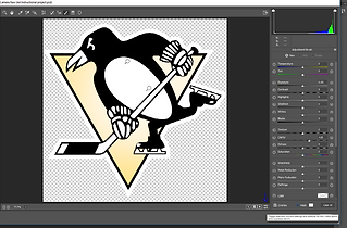
-page-001.jpg)
PROFICIENCY
WORD
95%
POWER POINT
90%
EXCEL
80%
IN DESIGN
PHOTOSHOP
ILLUSTRATOR
75%
70%
70%
PORTFOLIO

The images I used in my mood board are the things that would best describe who I am without giving my life story. Fishing is something I have enjoyed from the moment I caught my first bluegill in a pond as a child. It has since grown into one my passions. I love learning and trying new ways of fishing like fly fishing. I always look forward to fishing and spending time outdoors on the creek with my dad. Going to concerts is something that became a huge part of my life from the age of sixteen. I had been to a few shows before this with my dad and brother. When I started attending more with friends I fell in love. Since then I have been to more than seventy concerts, from small shows to big festivals like Vans Warped Tour. Hockey is easily my favorite sport, I have been watching it since my dad took me to my first game at the age of six. I enjoy playing it with friends, and on my own, either on the ice or on the street. I also love watching The NHL and following the Pittsburgh Penguins all season long.The colors I used in my mood board are ones that I feel follow the theme of my passions and hobbies. Green has been my favorite color since I was a child. The color green is seen all over the place when I'm fishing. From the leaves on the trees to the moss in on the bottom of the creek. The Brown is also a very earthy color that I associate with fishing its the some color of the mud I walk through and the bark of trees. It is the color of my boots and even seen in the patterns of some fish. The blue represents the open sky over top of the tint of blue on a sheet of ice ready for players to enjoy a game of hockey. The Yellow reminds me of the sun setting on many outdoor concerts and summer time festivals or on the evenings I waited in line for the doors to open. Lastly the fonts I used were ones I felt were free and flowed easily I didn't want something formal or professional. I feel as though these fonts feel a little bit more care free.
Instructional project
Step 1

After we have opened Photoshop and placed in an image we will right click on the name in the layers panel and click convert to smart object.
Step 3

Inside of Camera Raw filter I'll select the Adjustment brush icon to go into changing settings
Step 5

Here I am adjusting the exposure this can be any set number you like to brighten or darken your photo.

Step 7
From here I can use the brush tool to click and drag and paint over the areas I want to affect
Step 9

To clearly see which areas got painted over I selected the Mask box you can also click on the box to the right of it to change the color of the mask to help you see what areas were affected. You can also click on the erase button from here and click and drag over the photo to erase any unwanted changes.

When you have made the changes that you want come to the bottom of the page and click on OK this will confirm the changes made to the photo
Step 2

In our second step we will select at the top of the page filter and then click on Camera Raw filter
Step 4

From here I can adjust the flow and density simply by selecting the circle and sliding it left or right. I set them both to 100 for a common starting point.
Step 6

In this step I am enlarging the brush size to cover more area I did this by clicking and dragging on the slider
Step 8

Now that I have painted over the photo I can come back and change the exposure to lighten or darken the photo to my liking. To do this just grab the slider and slide to the right to brighten and to the left to darken.
Step 10
To check in on what has been changed from the original photo click on the icon here to toggle back and forth between the before and after simply by clicking on it once to see before and click on it again for the after.
Step 12

If you would like to make any more changes or simply go back into Camera Raw just double click on the camera raw filter here in the layers panel. From here you can make changes or if you're satisfied with your work click Ok and you're finished.
Personal Logo

The Personal logo I designed is a fly rod with my initials incorporated into the fly line. Fishing represents me very well, and is something I have been very passionate about since I caught my first fish. I started with the rectangle tool and curved the edges to achieve the look of a handle. I chose the light brown/tan color because it closely matches to a cork handle commonly seen on fishing rods. I used the shape builder tool to connect together the shape of the handle to the rod tip. The reel was made by using the ellipse tool to create a circle. I then copied some smaller circles and placed them inside to look like a fly rod reel. The tip of the rod was done using the rectangle tool. I stretched it out long and thin to make it represent a rod. I tilted it on an angle to better represent the rod. The fly line was made using the curvature tool I drew it pretty freely to look like line and finished it by incorporating my initials "RM" as part of the line. The fly line was then filled in with an orange stroke. This matches a commonly used color of fly line and the line color I currently use. The hook was also made with the curvature tool and finished off by shrinking down a triangle to give it a sharp point.
Heading 5
PR Writing


